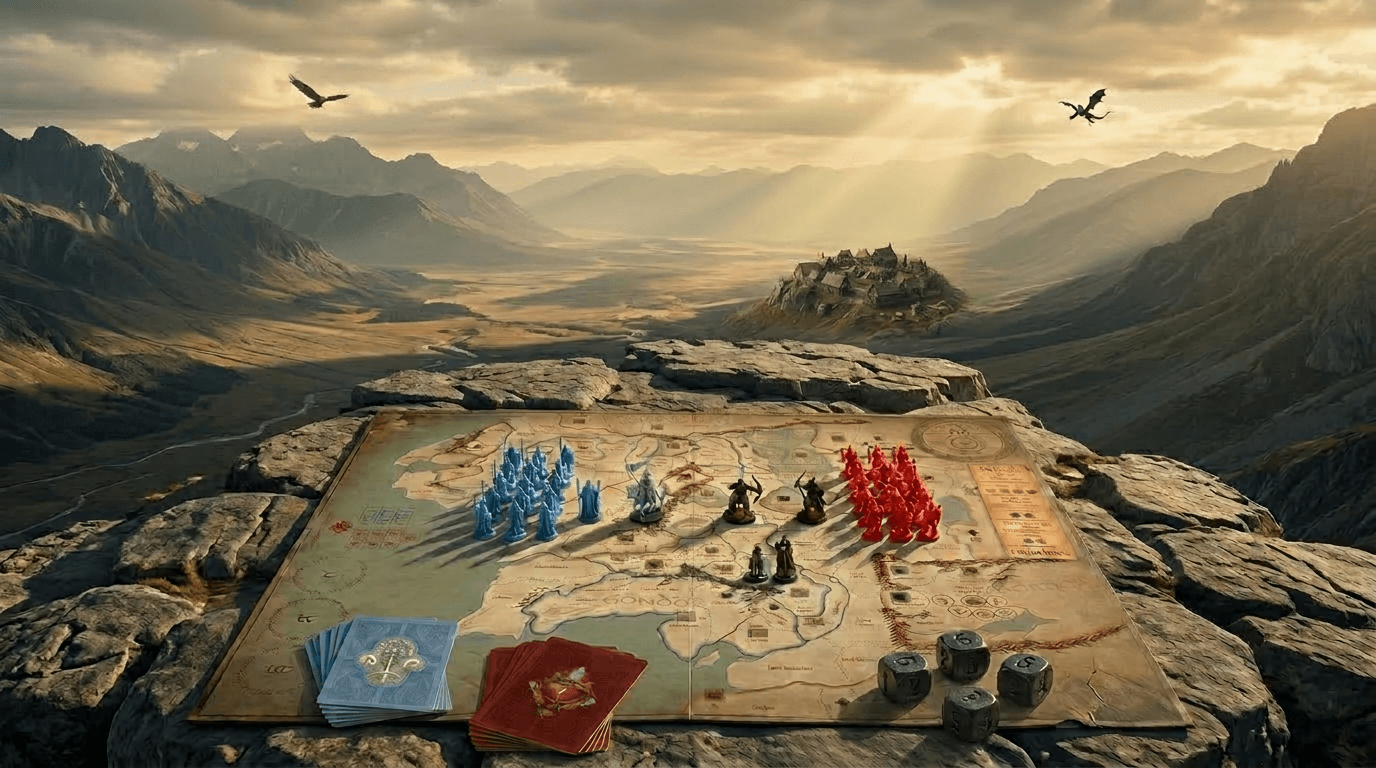
Case study
of
War of the Ring
the boardgame

UX + UI
update
by
Roman Šeiner
Intro
Why even having this case study
Because using UX UI standards on raw product is always great idea to use creativity and help yourself in the future.
How do I approach case study
Checking player actions, zoom in and out of game sessions and analyze. Then I design component rework create a Companion App with use of AI (Perplexity+Claude Code+Figma+Vercel+Github)
Refreshed gaming experience
If the heavy-rules games can beupdated using heuristic standard and proper UX+UI rework, players tend to replay the game more often, engage in tournament activity and support actively the community.
This is no longer just nostalgic entertainment for rainy weekends. It’s a fierce business boasting year-over-year growth of over 12%. It’s scaling so rapidly that interest in the Czech Republic in 2024 actually surpassed the strongest COVID-era peaks, generating a momentum that leaves plenty of digital startups in the dust. Today, adult players are investing more money than ever before in premium physical experiences. So, if you're looking for an industry with massive capital potential—where exceptional UX and design directly dictate sales success—you're looking right at it.
Research
Map Design
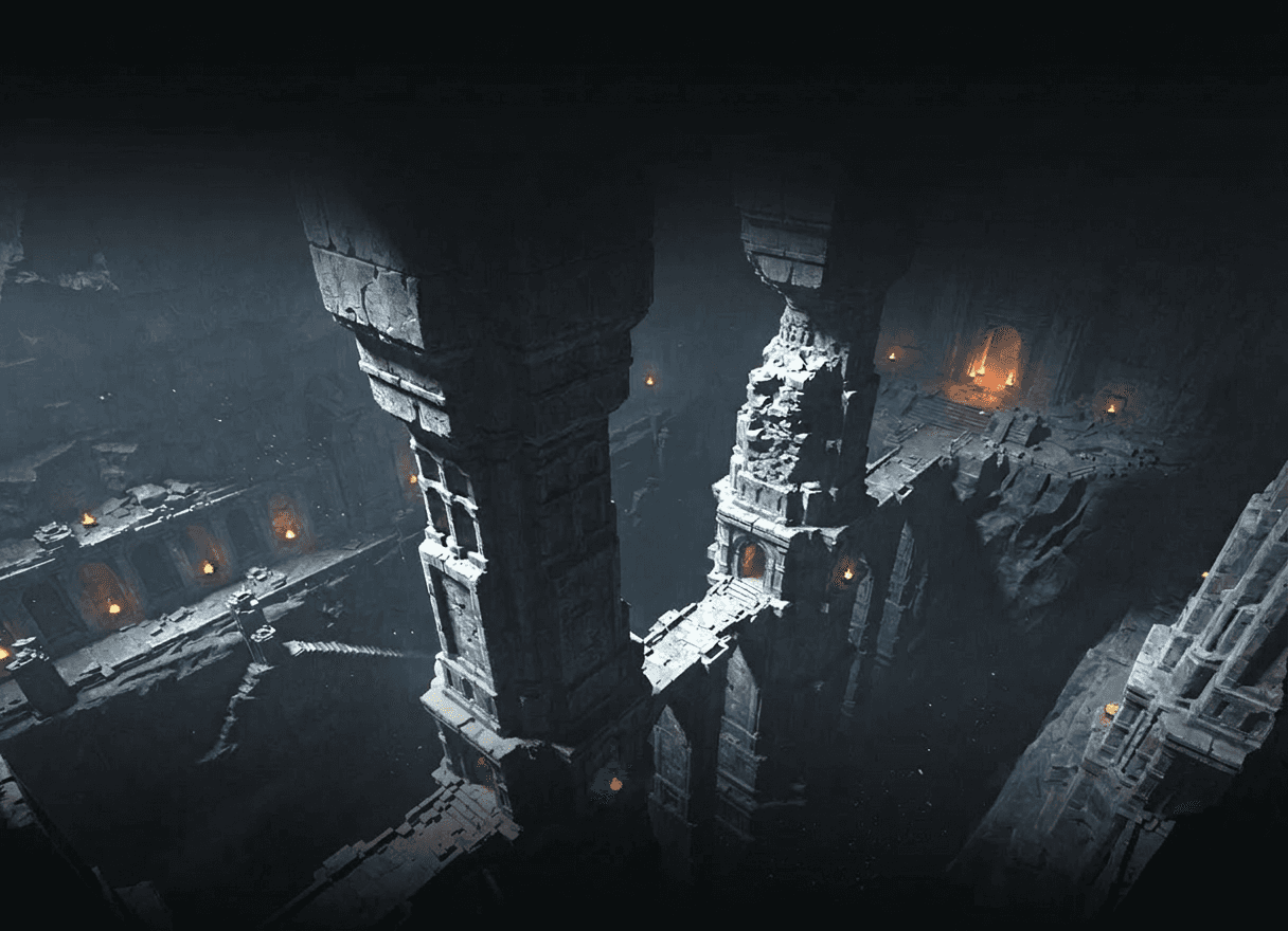
Game is played on a map - continent of Midddle-Earth. Surrounded by elements related to mechanisms, completely flooding edges of map.
Cleaning UI so player can focus on map
Player's Comfort
You are managing your units in war times. Combination of painpoints, components, game tempo and other leads to having a bad time. This can be solved.

Cleaning UI so player can focus on map
Game's scale
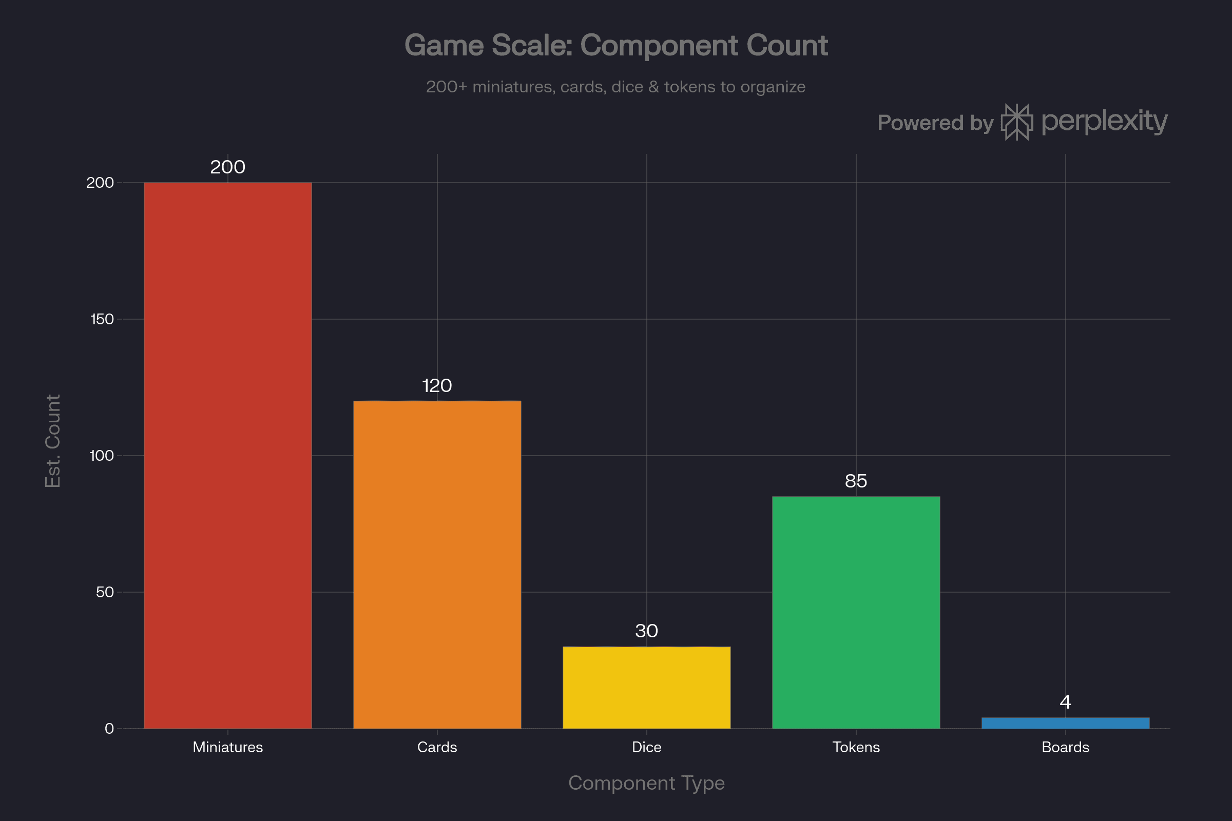
Huge map, 200+ miniatures, cards, dice, tokens miniatures, all enough to choke your cat / baby on. Any organizers will serve you well. This hugely affect focus reservoir..

Cleaning UI so player can focus on map
During my standard research of War of the ring's community, I've encountered great feedback, answers and much more.
Thanks to all creators.

Discord
Subchannesl to discuss anything
New videos summarized
Memes

Youtube
great long game videos by Pros
Mechanics Teaching videos
Video reviews
BoardGameGeek.com
Great files to download
Active forums
Feels like dedicated wiki
Product `& setup
Few facts about the game so you can imagine product I focus with redesign
since
0
0
Playtime
0+ min
0+ min
Expansions
0
0
Logged online games
0+
0+
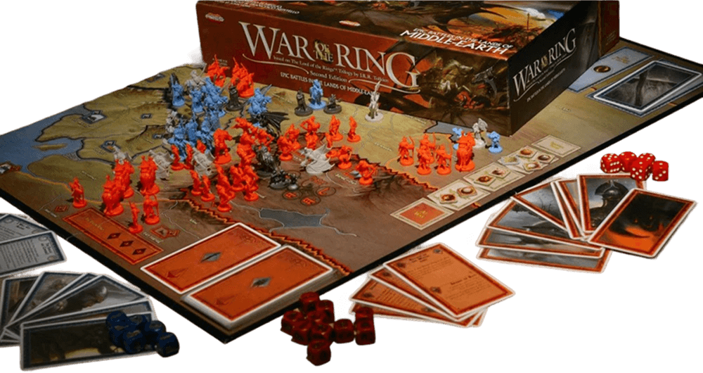
3-5 hours long
2-4 players
War game
Massive User interface
Dice
Lots of text
Challenging difficulty
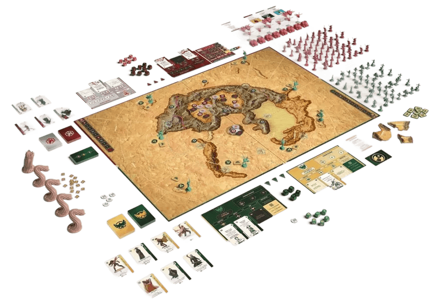
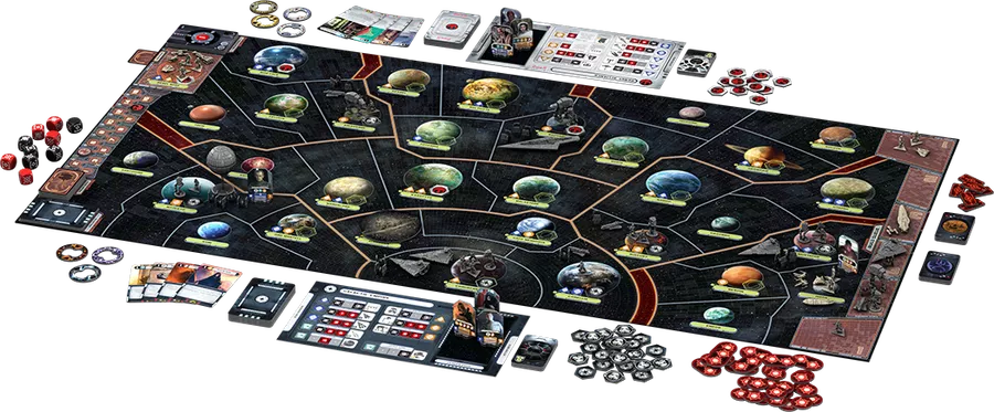
Similarly designed games
these games have usually same Vibe, if these themes fit you more, go for it.
Dune: War of Arrakis
Star Wars: Rebellion
Design approach
vanila game board has elements all over the board, I designated only left and right orientation. Keeping elements by sides and not front gives you option to put elements like dice, cards and tokens right infront of you and keep you in touch with the game. Another layer above - in between of the regions where action happnes - would overwhelm the player.
Top and bottom sides are cleaner, so players can place their cards here and rest hands.
The middle is reserved for redesigned Hunt pool.
Left side shows Strongholds of Free people, which are main target for military victory.
Below is Shadow's space for his giant armies, so you can keep it army here and use one Flag token.

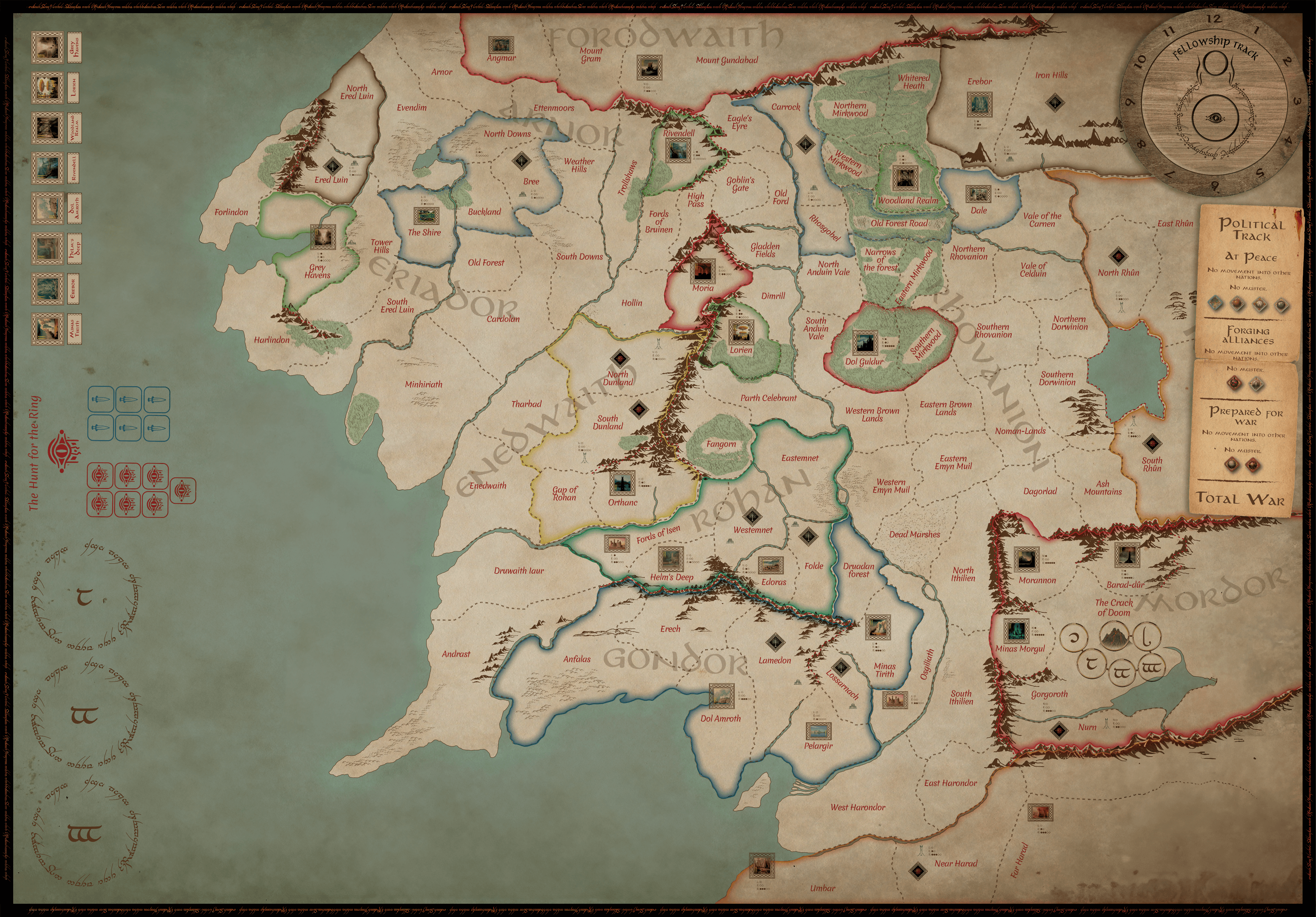
Righ side keeps Fellshowip / Corruption counter and Diplomacy track.
Shadow player usually takes bottom right for his cards, while keeping his armies closer.
Victory points are stored next to each of cities or stronghold.
Overall colours, fonts and markers were updated.
Painpoints
Focusing on actions, that needlesly take player's time or work against game's comfort. Time to rework game to your liking is time invested in your experience. And nobody wanta to spend 4 hours doing what feels tedious or wonky or worse.
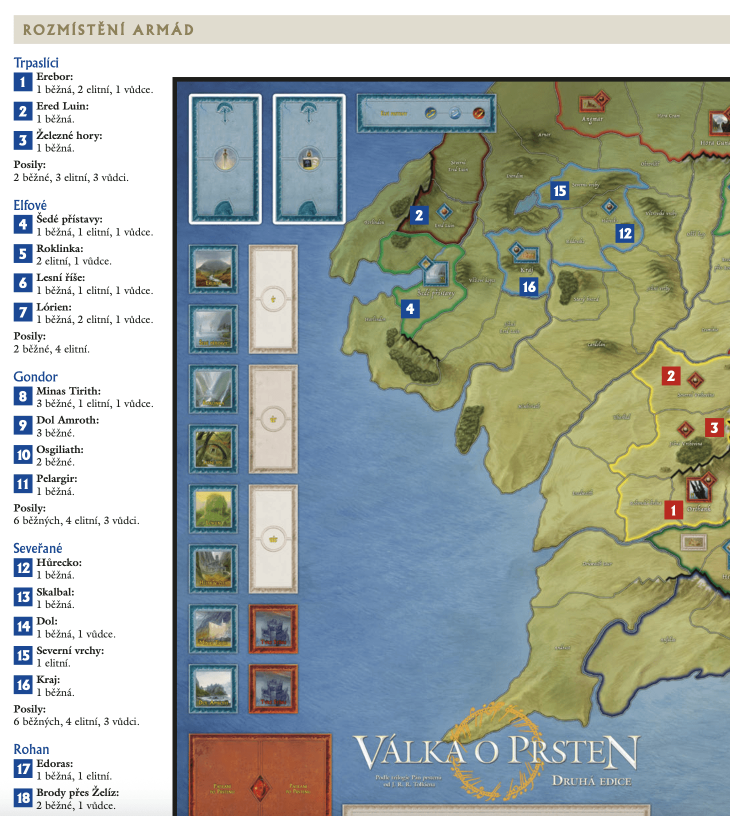
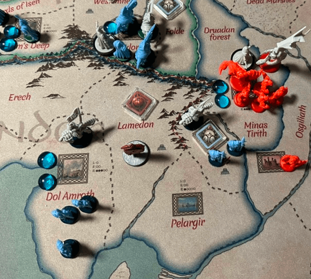
Tideous game setup
Original
Updated
View Details
Not intuitive
Need rules fo setup
View Details
No need for rules
Region related mark
Fast
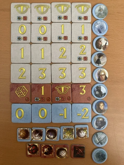
Proper Haptic experience
Original
Updated
View Details
Light weight
Damages overtime
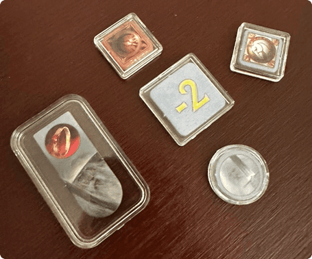
View Details
Better weight
Protected
Smooth slide effect
Miniatures
Original
Updated
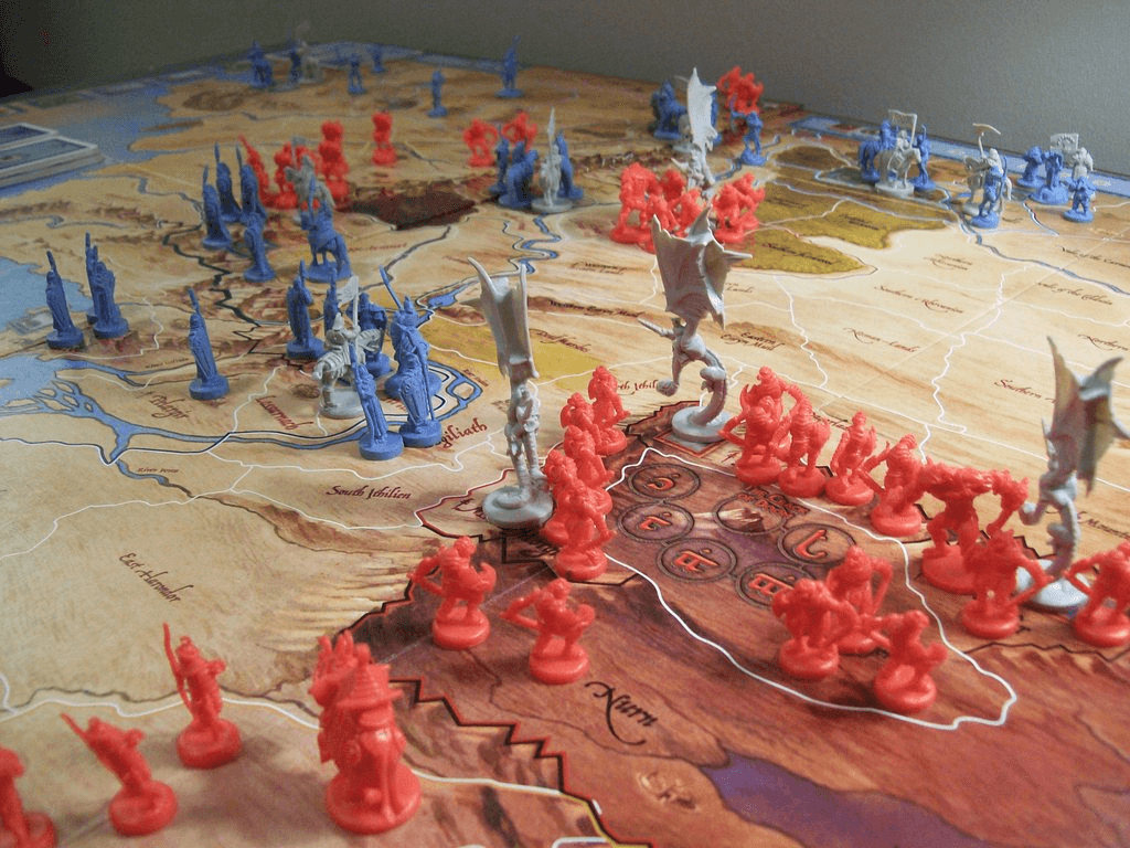
View Details
Poor identification
In plastic bags
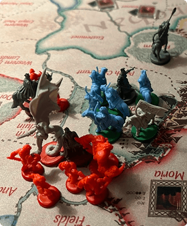
View Details
Painted standees
Army organizers
Painted Minion / Companions
Unique details in rules
Original
Updated
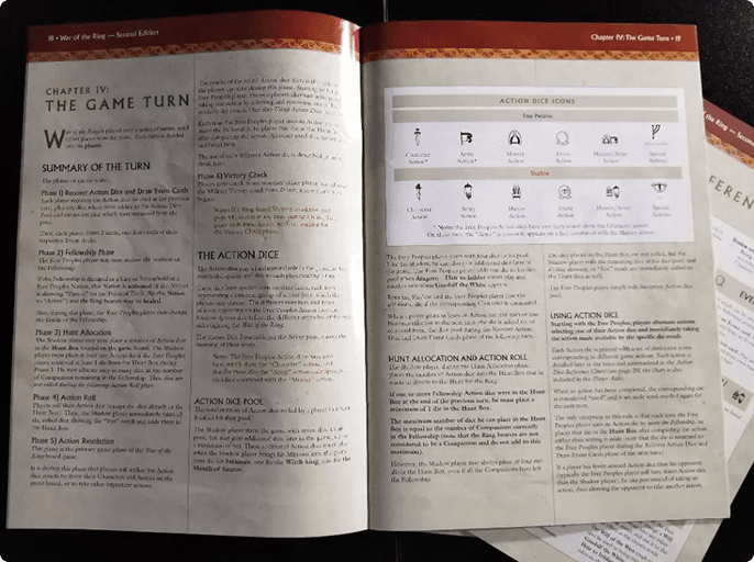
View Details
Hard to search
1 reader at a time
View Details
Fast
Lists sources
Unique cases smart search
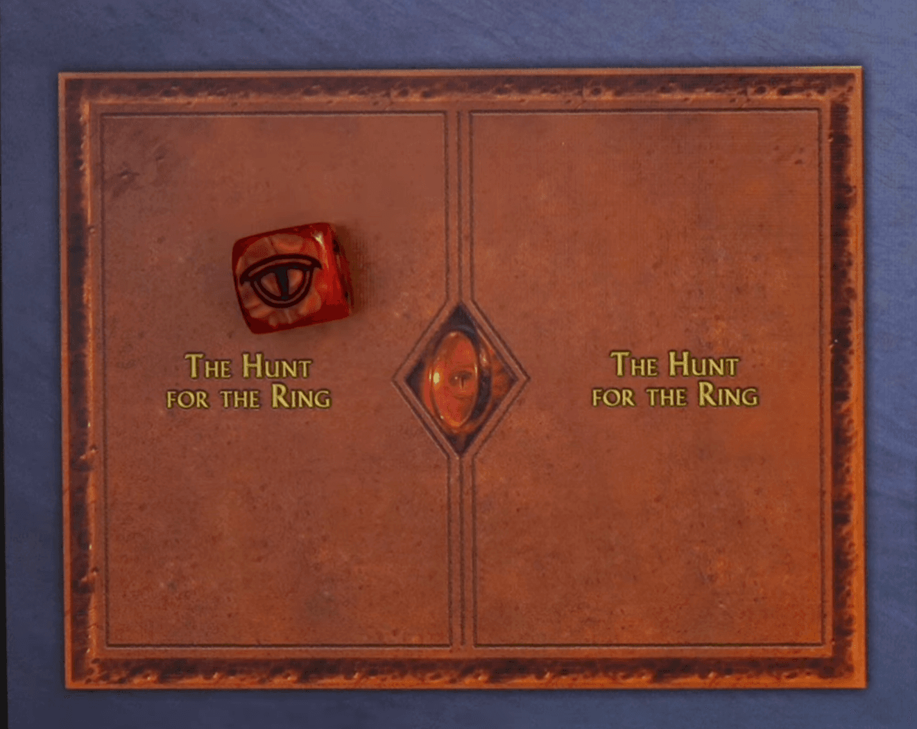
Unclear interface
Original
Updated
View Details
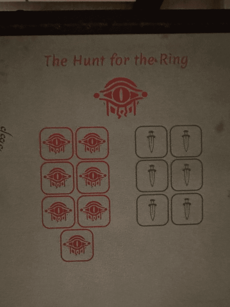
Discomfort location on map
UI not descriptive enough
View Details
Located in middle of map
Dice related location indicated

Feedback & Recommendations

This case study resulted into clear identification, that are responsible for great experience:
player's comfort & control over the game's components.
WotR is a big scale wargame where every mistake is well punished and it often comes to messy sideboard, so overflown attention is well done. This should lead to smooth gaming experience and reshape what boardgame experience can provide in it's gameplay.
I am not changing the rules.
Plastic covers
card sleeves, plastic cases on tokens etc.
Adds weight and feels great in hand
Price: 3€
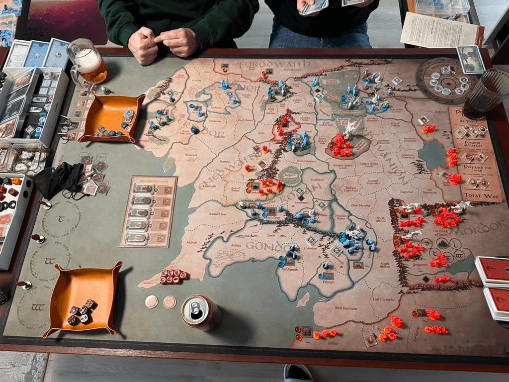
Neopren playmat
playmat is every game's pleasure point.
So naturally I changed UI so map is clean
Price: 80€ +
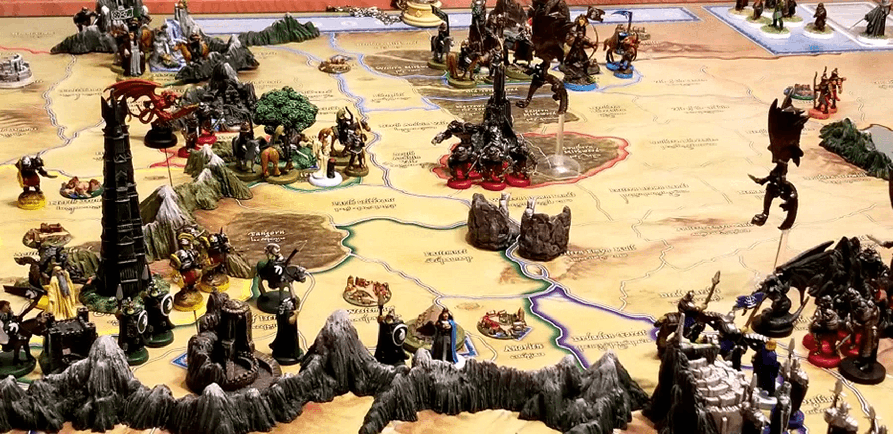
3D Printed elements
3D print mountains or even cities and srongholds. Middle Earth is
Price: 5€ +
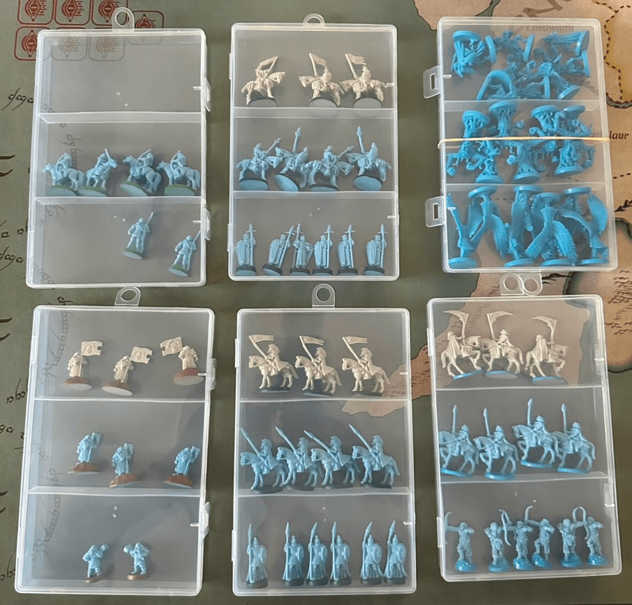
Army bento boxes
Organize your armies. Better UX and important to know during play
Price: 3€
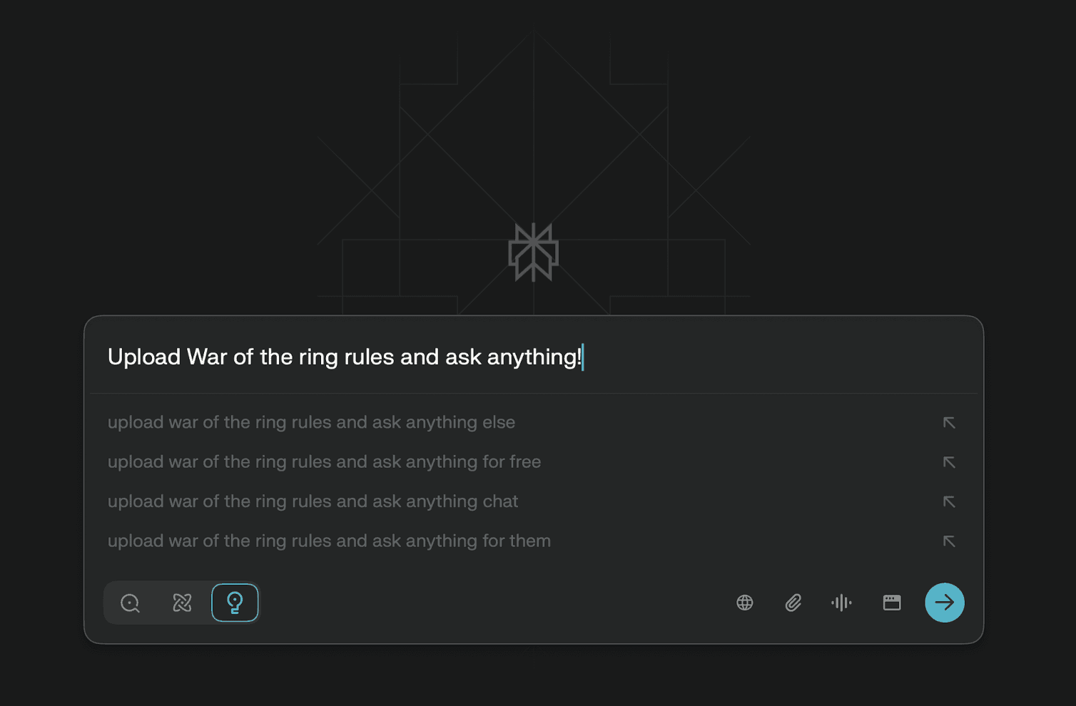
Rules fast and precise
Ask your favorite AI client, all you need is to upload official rules.
Price: 0-15€
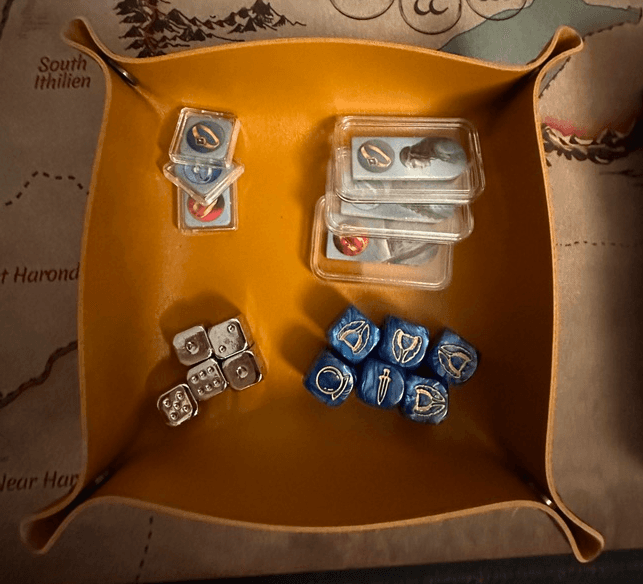
Sideboard storage
Game gets messy as you progress, what's active, how many dice can you roll, etc.
Price: 3€